The Process
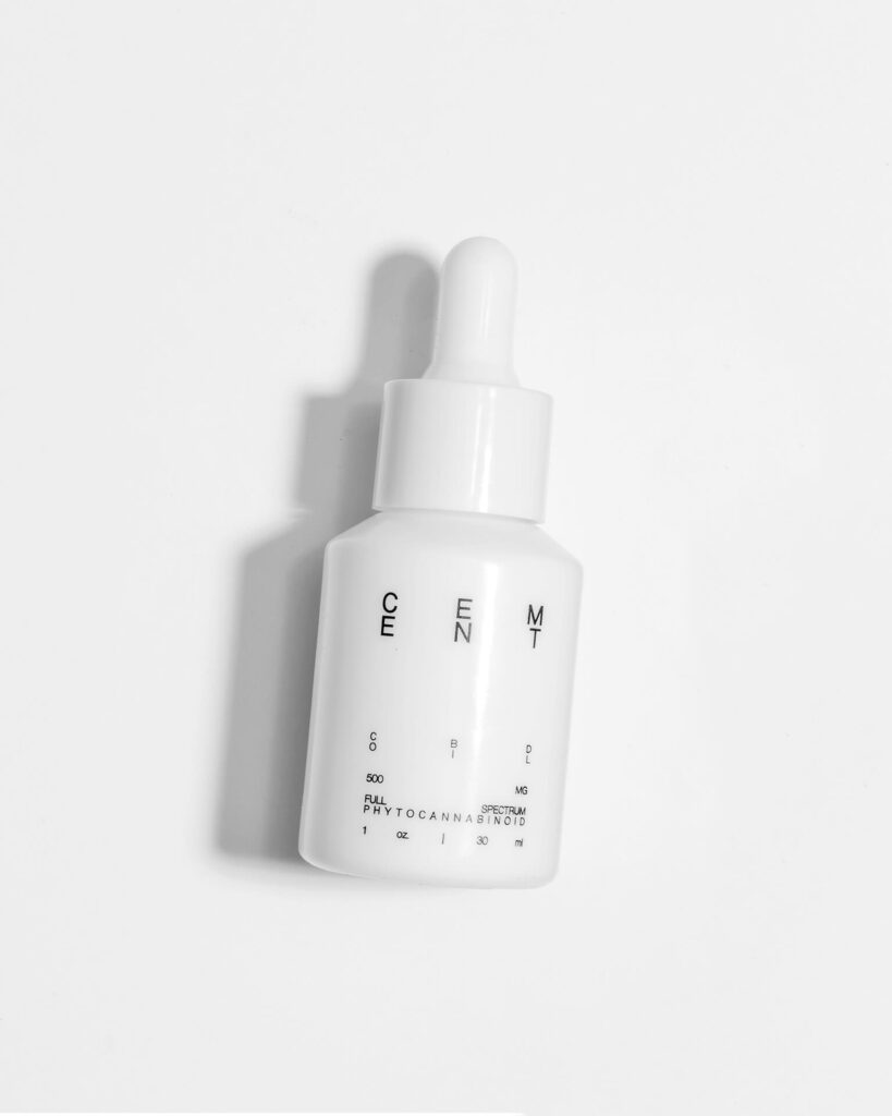
Often at times, it seems like we’re running away from shadows and always trying to minimize their intensity. It’s a typical trope of product photography. With these photos for Cement, we wanted to embrace the shape of the shadow and let it bring character. By placing our key light lower, those shadows extended and raked across the frame.
It was also a bold move to photograph a white product on a white surface. Contrast catches the eye, but we wanted to break that tradition. With Cement’s bottle design, we knew the sleek curvature would create nice highlights to define its shape. It’s this type of risk that leads to interesting images.


